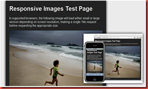
What is RWD?
It is a web design approach aimed at crafting sites to provide an optimal viewing experience—easy reading and navigation with a minimum of resizing, panning, and scrolling—across a wide range of devices (from mobile phones to desktop computer monitors.
Resizing – Alter the size of the image either small or big
Panning – moves the location of the picture where some part is only visible
Scrolling – to move up or down to know the information
Literally, the rwd concept is used to make all the devices compatible and auto adjust according to the resolution of the device.
How it is possible or what is the method to deploy the RWD concept?
A site designed with RWD with adapts the layout using Fluid grid, Flexible images, Media Queries and Server-side.
Fluid Grid – It helps to size the page element using Percentage not by pixels or points
Flexible Images – also sized in relative units, to prevent them from displaying outside their containing element
Media Queries – allow page to use different CSS style based on the characteristics of the device – most commonly the width of the browser
Server-Side – helps to produce faster-loading sites for access over cellular networks and also deliver rich functionality or Usability
How to add it to the CSS?
@media screen and (max-width :590px) {
img
{
width: 100%
}
}
What happens?
The image will automatically adjust the screen resolution and resizable image. This will automatically happens in all the resolution or devices.
The min-width property sets a minimum browser or screen width that a certain set of styles (or separate style sheet) would apply to. If anything is below this limit, the style sheet link or styles will be ignored.
The max-width property does just the opposite. Anything above the maximum browser or screen width specified would not apply to the respective media query.
~~~~~~~~~~~~~~~~~~~~~~~~~~~~~~~~~~~~~~~~~~~~~~~~~~~~~~~~~~~~~~~~~~~~~~~~
A very simple example for RWD concept with the CSS- Media Queries as follows,
1. HTML
<html>
<head>
<link type="text/css" rel="stylesheet" media="all" href="style.css">
<body>
<div id="content">
<img src="filename.jpg" width=500 height=500>
</div>
<div id="sidebar-left">
<h2>A Left Sidebar</h2>
</div>
<div id="sidebar-right">
<h2>A Right Sidebar</h2>
</div>
</body>
</html>
2. CSS
@media screen and (max-width:590px){
#content{
width: 100%;
}
#sidebar-left{
width: 70%;
float: left;
margin-right: 3%;
background: blue;
}
#sidebar-right{
width: 30%;
float: left;
background: green;
}
img {
width: 100%;
}
}

No comments:
Post a Comment